Introduction

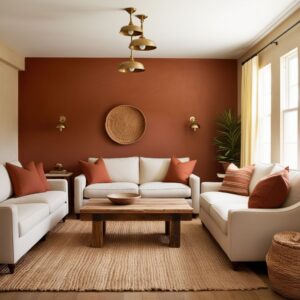
Colour and colour psychology is one of the most powerful tools in interior design.
The right colour can make a room feel calm, energetic, spacious, warm or sophisticated. The wrong combination can make the same space feel dull, overwhelming or visually smaller.
But choosing colours is not simply about following trends.
Colour psychology in interior design looks at how different colours, tones and combinations can influence the way we perceive and experience a space.
However, there is no universal rule that one colour creates exactly one emotion. Personal preferences, cultural associations, natural light, room size and even the intensity of the colour all affect the final result.
The best approach is to combine psychology with the practical requirements of each room.
How Colour Psychology Works in Interiors
Colour can influence the perceived atmosphere of a room in several ways.
Warm colours
Reds, oranges, yellows and some warm neutrals can create a sense of warmth, energy and visual activity.
Cool colours
Blues, greens and some cool greys can create a calmer and more relaxed feeling.
Neutral colours
White, beige, cream, taupe and grey provide flexibility and can create a sophisticated background for furniture and artwork.
Dark colours
Deep shades can add drama, intimacy and visual depth, but using too much of them can make a poorly lit room feel heavy.
The shade, saturation and quantity of colour are often more important than the basic colour itself.
1. Living Room: Create a Welcoming Atmosphere
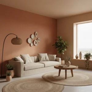
The living room is usually one of the most social spaces in an Indian home.
It needs to work for family gatherings, guests, conversations and everyday relaxation.
Good colour directions include:
-
Warm neutrals
-
Beige
-
Greige
-
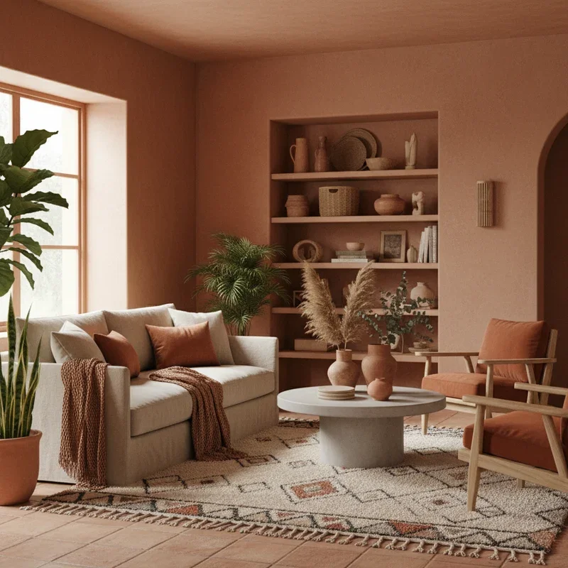
Soft terracotta
-
Muted green
-
Warm white
-
Subtle earthy tones
If you want a more dramatic interior, deeper colours can be used on a feature wall or in furniture rather than across every surface.
Practical tip
Use the 60-30-10 approach as a starting point:
-
60% dominant colour
-
30% secondary colour
-
10% accent colour
It is not a strict rule, but it can help prevent a room from becoming visually chaotic.
2. Bedroom: Prioritize Calm and Comfort
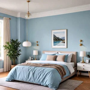
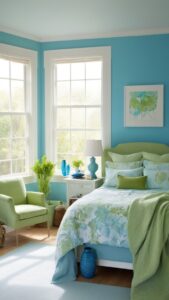
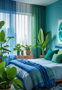
Bedrooms generally benefit from colours that feel restful rather than highly stimulating.
Consider:
-
Soft blue
-
Muted green
-
Warm beige
-
Cream
-
Taupe
-
Dusty rose
-
Soft grey
-
Earthy neutrals
Very intense reds, oranges or highly saturated colours may feel too energetic for a bedroom when used extensively.
However, this doesn’t mean a bedroom has to be boring.
You can introduce stronger colours through:
-
Headboards
-
Cushions
-
Artwork
-
Curtains
-
Accent walls
-
Bed linen
The objective is to create a space that feels comfortable to you.
3. Kitchen: Balance Energy and Cleanliness
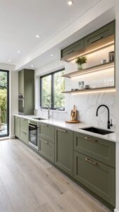
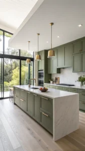
Kitchens can accommodate more energetic colours because they are active working spaces.
Depending on the style, consider:
-
White
-
Cream
-
Warm grey
-
Olive green
-
Terracotta
-
Muted yellow
-
Deep blue
-
Natural wood tones
White and lighter colours can make a compact kitchen feel brighter and more open.
For Indian kitchens, however, practicality matters as much as appearance. Choose finishes that can handle cooking-related stains, moisture and regular cleaning.
4. Dining Area: Encourage Warmth and Conversation
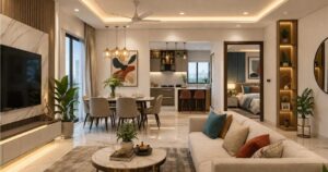
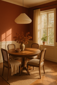
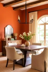
The dining area benefits from colours that create a warm and comfortable atmosphere.
Suitable choices can include:
-
Terracotta
-
Warm beige
-
Muted orange
-
Olive green
-
Warm wood tones
-
Cream
-
Earthy browns
You don’t need strong colours across the entire room.
A warm accent wall, artwork, upholstery or pendant lighting can introduce the desired character without overwhelming the space.
5. Home Office: Support Focus
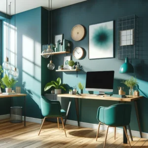
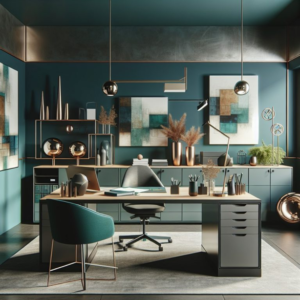
A home office should feel stimulating enough to maintain energy while remaining calm enough for concentration.
Good options include:
-
Soft green
-
Blue-grey
-
Warm neutral
-
Beige
-
Muted teal
-
Natural wood tones
If the room receives limited natural light, avoid making it excessively dark unless that atmosphere is intentional.
Colour should also work with your screen and task lighting. Highly reflective or extremely bright surfaces can sometimes become visually distracting.
6. Children’s Bedroom: Use Colour Carefully
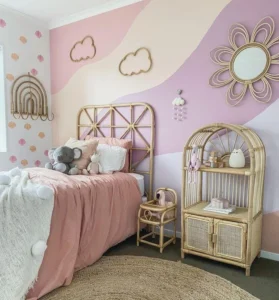
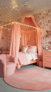
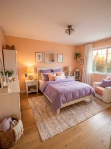
Children’s rooms can accommodate more playful colours, but covering every wall in highly saturated colours can quickly become overwhelming.
Instead, consider:
-
Soft blue
-
Green
-
Warm yellow
-
Peach
-
Lavender
-
Pastel tones
Stronger colours can be introduced through removable or replaceable elements such as:
-
Rugs
-
Curtains
-
Artwork
-
Bedding
-
Furniture
-
Wall graphics
This makes it easier to update the room as the child grows.
7. Bathroom: Create a Clean or Spa-Like Feel
Bathrooms often work well with colours associated with cleanliness and relaxation.
Consider:
-
White
-
Off-white
-
Light grey
-
Beige
-
Sage green
-
Blue
-
Natural stone tones
For a luxury bathroom, darker colours can also work effectively when combined with sufficient lighting and contrasting surfaces.
The key is to balance colour with the size and natural/artificial lighting of the bathroom.
8. Entrance and Foyer: Make the First Impression
The entrance sets the visual tone for the rest of the home.
Depending on the style, you can use:
-
Warm neutrals
-
Earthy colours
-
Soft beige
-
Olive
-
Terracotta
-
Wood tones
A smaller entrance can benefit from lighter colours, mirrors and good lighting to create a more open feeling.
9. Small Rooms: Use Colour to Control Perception
Colour cannot physically increase the size of a room, but it can influence how spacious it appears.
For smaller rooms:
-
Use lighter colours where appropriate
-
Keep the palette relatively consistent
-
Use mirrors strategically
-
Maximize natural light
-
Avoid excessive visual contrast
A darker accent wall can still work in a small room if it is intentionally designed.
The goal is not to follow the rule “small room = white walls.”
Instead, consider how colour interacts with light, furniture and proportions.
10. Consider Natural Light Before Choosing Colour
This is one of the most important aspects of interior colour selection.
The same paint colour can look completely different depending on:
-
Window orientation
-
Amount of daylight
-
Artificial lighting
-
Time of day
-
Wall finish
-
Surrounding colours
A warm colour may appear more intense in strong sunlight, while a cool grey can appear noticeably different under warm artificial lighting.
Always test paint or finish samples in the actual room before making the final decision.
11. Don’t Ignore the Ceiling
The ceiling is often treated as an automatic white surface, but it doesn’t have to be.
A light ceiling can help maintain a sense of openness.
However, in a larger or taller room, a darker or contrasting ceiling can create a more intimate and dramatic atmosphere.
The ceiling colour should be considered together with:
-
Wall colour
-
Lighting
-
Ceiling design
-
Room height
-
Overall interior style
12. Create a Whole-Home Colour Palette
One common mistake is selecting each room independently.
A home can have different colours in different rooms, but there should still be some visual relationship between them.
For example, you might use:
Base palette: warm white + beige
Secondary palette: wood + muted green
Accent: terracotta
These colours can then be distributed differently throughout the home.
This creates variety without making the interiors feel disconnected.
Common Colour Selection Mistakes
Choosing colours only from a trend
A colour that is fashionable today may not suit your home or remain appealing for years.
Ignoring lighting
Paint colours can look dramatically different under different lighting conditions.
Using too many colours
A large number of unrelated colours can make an interior look visually fragmented.
Making every room identical
Consistency is useful, but every room doesn’t need exactly the same colour.
Using extremely saturated colours everywhere
Strong colours can work beautifully as accents but may become overwhelming when used excessively.
Selecting colour before materials
Flooring, marble, wood, upholstery and furniture finishes all influence how a wall colour appears.
How to Choose Colours for Your Home
A practical process is:
Step 1: Identify the purpose of each room.
Step 2: Check natural and artificial lighting.
Step 3: Select a broad colour family.
Step 4: Choose the dominant, secondary and accent colours.
Step 5: Compare colours with flooring, furniture and fabrics.
Step 6: Test physical samples in the actual room.
Step 7: Observe them at different times of the day.
Step 8: Finalize the palette only after seeing the complete combination.
This approach is far more reliable than choosing a colour simply because it looks attractive in a catalogue or Instagram image.
Final Verdict
Colour psychology can be a useful tool in interior design, but it should not be treated as a rigid scientific formula.
The best colour for a room depends on its purpose, lighting, size, materials, architecture and the people using it. Use calmer tones where you want relaxation, warmer or more energetic colours where you want activity and stronger colours selectively where you want visual impact. Most importantly, don’t choose colours in isolation.
A successful interior colour palette is one where walls, flooring, furniture, lighting, fabrics and finishes work together. The goal isn’t simply to make a room colourful.
The goal is to make the room feel right.
At Design Within, we believe a beautiful interior should not only look good when it is completed — it should also perform well for years.
Before we dive into more details about Color Psychology in Interior Design, it might be helpful to estimate how much your interior design project could cost. Understanding your budget can help you make more informed decisions about what features to prioritize. To get a better idea, you can use our ‘interior design budget calculator’ budget calculator and start planning your dream home today.
Frequently Asked Questions
1. What is colour psychology in interior design?
Colour psychology in interior design refers to how colours and colour combinations can influence the perceived mood and atmosphere of a space. The effect varies according to shade, lighting, context, culture and personal associations.
2. What is the best colour for a bedroom?
Soft blues, muted greens, warm neutrals, beige, cream and other subdued colours are commonly suitable for creating a calm bedroom. The best choice ultimately depends on the room’s lighting and the occupants’ preferences.
3. Which colours make a room look bigger?
Lighter colours can help a room feel more open, particularly when combined with good lighting and a relatively consistent palette. However, colour alone cannot physically increase the size of a room.
4. What colours are best for a living room?
Warm neutrals, beige, greige, muted greens, earthy tones and warm whites are versatile choices for living rooms. Stronger colours can be introduced through accent walls, furniture and accessories.
5. Is blue a good colour for a bedroom?
Blue can work very well in bedrooms, particularly when softer or muted shades are used. However, the exact shade and lighting conditions matter more than simply choosing “blue.”
6. Are dark colours suitable for small rooms?
Yes. Dark colours can create depth and drama even in smaller rooms. However, they need to be balanced with appropriate lighting, furniture and contrasting elements.
7. How many colours should be used in an interior?
There is no fixed number. A simple dominant, secondary and accent colour structure can make it easier to create a balanced palette without making the interior visually chaotic.
8. Should every room in a house have the same colour?
No. Different rooms can have different colour schemes. However, using a consistent base palette or repeating certain colours and materials can create better visual continuity throughout the home.
9. Why does paint colour look different at home than in a sample?
Lighting, wall size, surrounding materials, time of day, paint finish and artificial light can all change how a colour appears. Always test samples in the actual room before finalizing the colour.
10. What is the most important thing when choosing interior colours?
Don’t choose colour in isolation. Consider natural light, room function, flooring, furniture, finishes and the overall home palette before making the final decision.